1st Edition (1977) Monster Manual art vs 5th Edition (2014)

Ever wonder what those beautifully painted monsters in your source book looked like when they were originally drawn in 1977? Let’s explore some retro D&D art!

The cover of the "Advanced Dungeons & Dragons Monster Manual" is illustrated with a variety of fantastical creatures. A large red dragon with extended wings dominates the upper right, brandishing a club, next to the bold red title text. Below, a majestic unicorn with a golden mane stands on the left, while a green, lizard-like creature with a staff and a bird-like monster with a wide beak are on the right. The book's author, Gary Gygax, is credited at the bottom. The background depicts a serene outdoor scene with trees, sky, and a cliff edge.


While the heart of Dungeons & Dragons has endured over the decades, the supporting material has most definitely had a nip, tuck and facelift (or two) along the way. Even without the dazzling array of 3D-printed minis, scenery, and electronic landscapes to augment our imaginations, we’ve been quietly spoiled over the years by an ever-improving collection of D&D art.

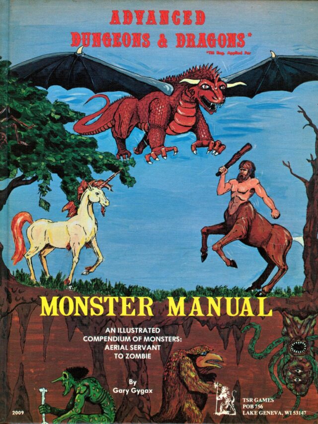
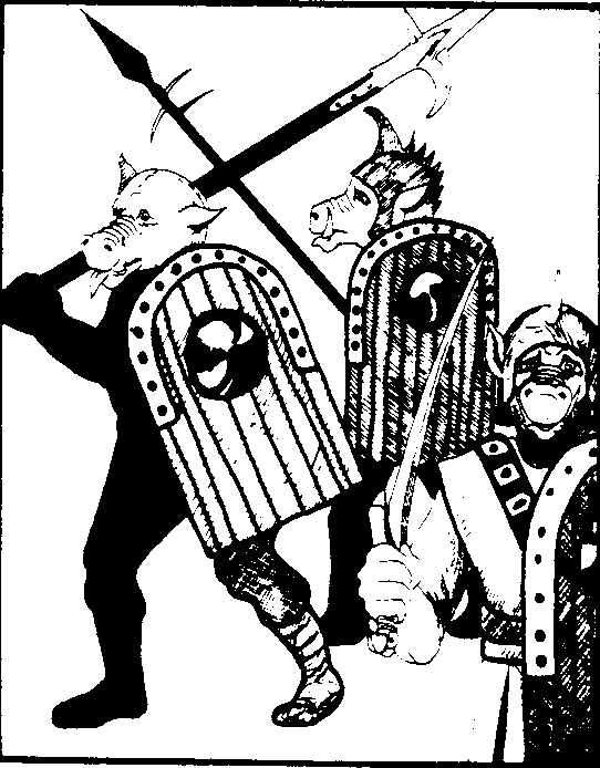
The original Edition 1 Monster Manual

The cover of the "Advanced Dungeons & Dragons Monster Manual" is illustrated with a variety of fantastical creatures. A large red dragon with extended wings dominates the upper right, brandishing a club, next to the bold red title text. Below, a majestic unicorn with a golden mane stands on the left, while a green, lizard-like creature with a staff and a bird-like monster with a wide beak are on the right. The book's author, Gary Gygax, is credited at the bottom. The background depicts a serene outdoor scene with trees, sky, and a cliff edge.
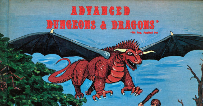
The original 1977 “Advanced Dungeons & Dragons” Monster Manual

While there are several slightly later reprints available on Amazon, if you’re after an original hardback of the Gary Gygax classic, they range on eBay from anywhere between £16 ($20usd) to £500 ($625usd) – oof! If your current party is trading more on copper than gold, you can of course check out the PDF version for free here.

For some, the hefty price tag represents a piece of D&D history. Containing over 360 monsters, the 108-page book was the first hardcover book available for any D&D game and set the style for future wargaming books.

So let’s dive right in and trace our 5th edition monster art back to its roots!

5th Edition Beholder

A vividly colored illustration shows a Beholder from the Dungeons & Dragons fantasy role-playing game. The creature has a bulbous, central body shaded in hues of pink and purple, with wrinkled, flesh-like texture. It features a prominent, oversized central eye that emits a violet glow, and a large, fanged mouth beneath it. Several flexible eye stalks extend from the top and sides of its body, each tipped with a smaller eye that has a distinct, focused iris. The background is minimal, with light washes of blue and white, giving the impression that the creature is floating or airborne.

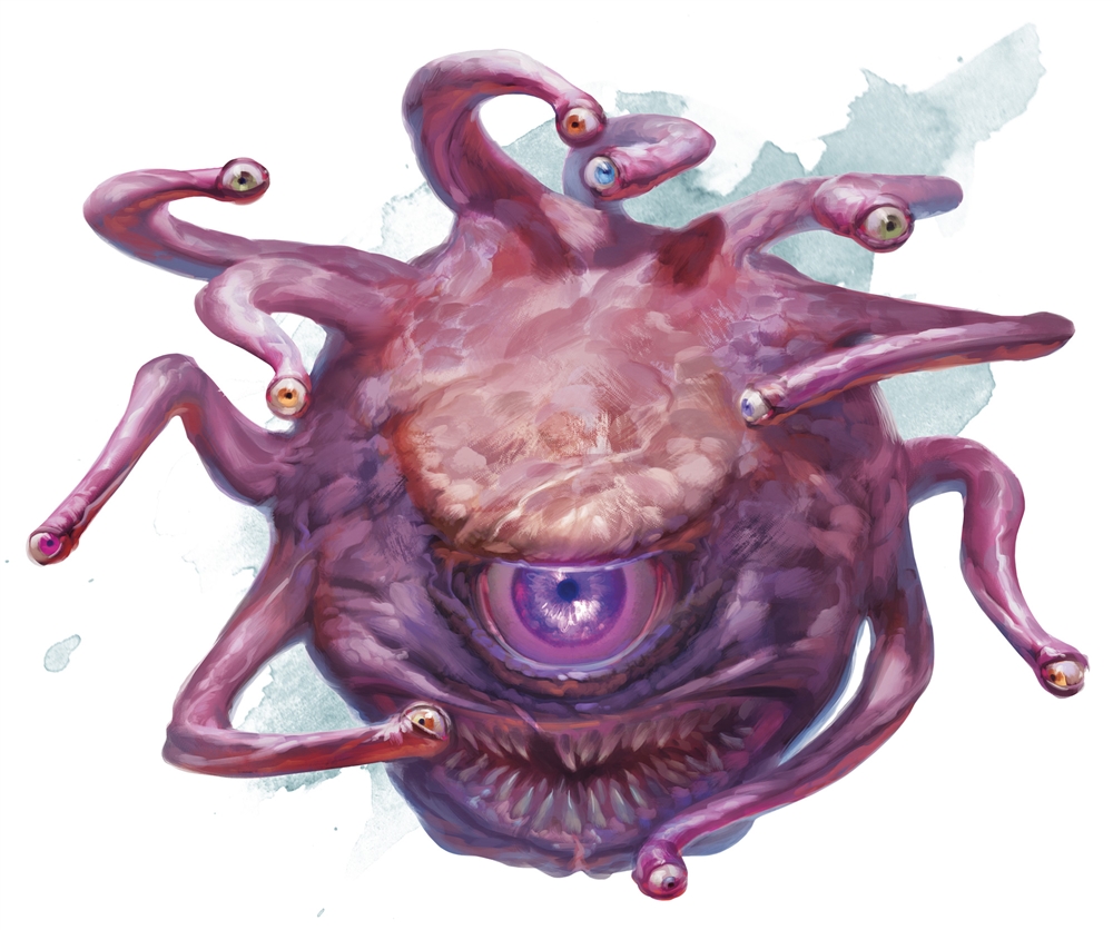
A classic D&D monster, the 5th edition beholder is a sight: A bulbous, 11-eyed body that just seems to radiate evil intentions.

1st Edition Beholder

A black and white ink drawing depicts a Beholder, a classic creature from the Dungeons & Dragons fantasy role-playing game. The creature has a large, spherical body covered in a chitinous armor with patterns resembling a patchwork of various shapes. Multiple eye stalks sprout from the top of its body, each ending in an eyeball that looks in different directions. The central eye is large, with an intensely staring pupil, and the creature's mouth is wide open, revealing sharp, pointed teeth. The style of the drawing is detailed, with cross-hatching used to create shadows and texture.

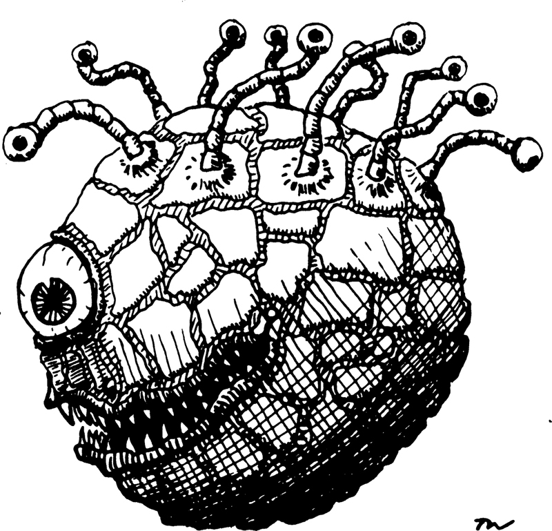
I’m going to be honest, this is probably my favourite original bit of D&D art. It reminds me a little bit of a 1980’s Mad Ball toy. A kind of methamphetamine-addled beach ball with a net thrown over it and decidedly noodly eyestalks. Maybe it was scarier at the time?

5th Edition Bugbear

An illustration presents a bugbear, a creature from Dungeons & Dragons. The bugbear is depicted in mid-roar, with a fearsome expression on its canine-like face and pointed ears angled back. It wields a large, spiked club in its right hand, raised as if ready to strike. The creature's body is muscular and covered with shaggy brown fur. It wears a simple, dark kilt with a studded belt and matching bracers on its wrists, suggesting a primitive armor. Its stance is wide and aggressive, enhancing the menacing quality of its pose. The background is a muted wash of gray and white, resembling a cloudy sky or foggy backdrop.

Familiar to many players, as their encounter in some of the most popular D&D starter campaigns, the Bugbear art does a great job of creating the image of a brutish opponent that’s maybe not too bright. The canine-like face and pointed ears angled back detracting from the human features associated with intelligence.

1st Edition Bugbear

A black and white ink drawing depicts a bugbear, a fantasy creature known in the Dungeons & Dragons game. It's shown grinning menacingly, holding a large sword that appears too big for its size. The bugbear has a furry body, pointed ears, and small, dark eyes, adding to its goblin-like appearance. It wears a checkered tunic with no sleeves, and its posture is confident and challenging. The drawing is framed within a coffin-like hexagonal border, accentuating the creature's eerie and ominous presence.

This guy looks straight-up cuddly. It’s not so much the flattened head given an “impish” appearance as much as the ratio that’s going on. Our 5th edition Bugbear looks tall and powerful, while this little guy looks positively stumpy, sporting the build of a near-pension age fisherman that’s spent too long down the pub. 1st edition Bugbear was most definitely skipping leg day.

5th Edition Goblins

The artwork captures a group of goblins poised on a rocky outcrop, with a misty, forested landscape stretching out behind them. These goblins are equipped for battle, wearing armor and wielding sharp, jagged weapons. Their expressions are fierce and focused, with the central goblin squatting at the forefront, leading the pack. The surrounding trees are barren and twisted, contributing to the ominous atmosphere. In the background, the forest recedes into a hazy fog, with hints of a campfire glowing faintly in the distance. The palette is dominated by cool tones, creating a sense of dampness and chill that suits the goblins' stealthy, menacing demeanor.

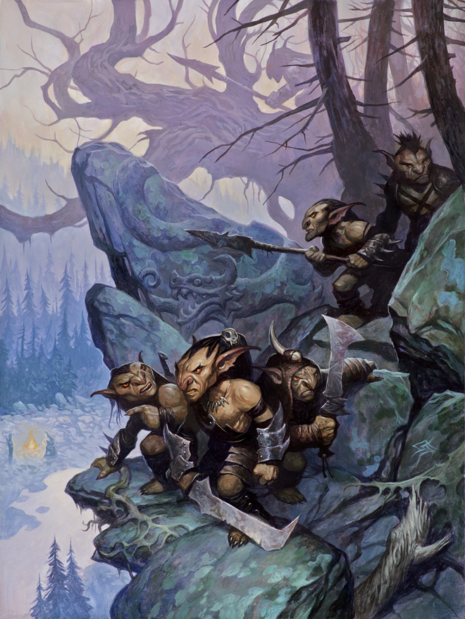
Goblins have long been the fodder of many fantasy a setting; weak, easily dispatched and rarely a serious threat. I’ve always thought the 5th edition Goblin design was almost too good – they actually look pretty dangerous. Of course, maybe I’m just projecting myself into the Forgotten Realms where I’d be at best a 4HP villager with uninteresting dialogue, but these goblins look more sturdy than they have any right to be.
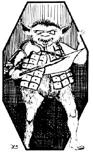
1st Edition Goblins

A black and white illustration shows a goblin in full sprint, brandishing a spiked mace in its right hand and a shield in its left. The goblin wears a simple tunic with a belt across the chest and is depicted with exaggerated facial features, including wide eyes, a snarling mouth, and pointed ears. Its posture and facial expression convey a sense of aggression and readiness for combat. The artist's initials are visible in the lower right corner of the image. The style of the drawing, with bold lines and stark contrast, gives it a classic, almost comic appearance.I’m actually not too sure what to make of the first edition goblin. If I found myself adventuring, I imagine I’d end up with my skull caved in while I started at those weirdly large forearms as the gurning face bore down on me. It looks a little bit too much like a very ugly child that’s had an allergic reaction to something it has eaten.

5th Edition Mind Flayer

mindflayer, a classic adversary in Dungeons & Dragons lore. The creature stands with an imposing stature, draped in a regal, flowing robe with a high collar and a red lining that flares out dramatically. Its skin is a smooth, pale grey, and its head features octopus-like tentacles where a mouth would be. It has deep-set white eyes lacking pupils, which contribute to its alien appearance. The mindflayer's armor is ornate, with shoulder pauldrons and a breastplate that carry a skull motif, and its left hand is raised in a menacing gesture, with long, claw-like fingers extended. The background is understated, with a soft wash of color that highlights the figure without competing for attention.

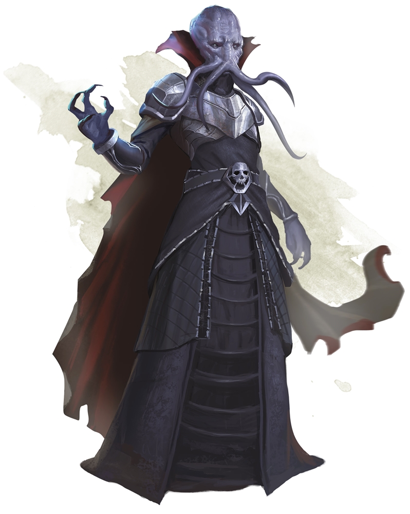
Mind Flayers: the soulless psionic terror that even the dark elves are afraid of or sexy psychic bastards [warning BG spoilers ahead], depending on your point of view. Mind Flayers have definitely gone through an evolution and really, their physical form is of little consequence given their powers. Despite the always dapper-fitting threads, they really are pretty creepy squid guys, though.

1st Edition Mind Flayer

A black and white ink drawing captures a mindflayer from Dungeons & Dragons. Enclosed within a hexagonal border, the creature is depicted with its distinctive octopus-like head and tentacles that hang around where a human's mouth would be. Its eyes are simple and dark, adding to its mysterious visage. The mindflayer wears a flowing robe adorned with patterns and a medallion featuring a skull at the center of its chest, suggesting a high rank or status. One arm is bent at the elbow and raised slightly, while the other is extended outward, both ending in clawed hands. The artist's initials, "DCS," are in the lower corner, indicating their signature on the work. The style is reminiscent of early fantasy illustrations with its bold lines and dramatic shading.

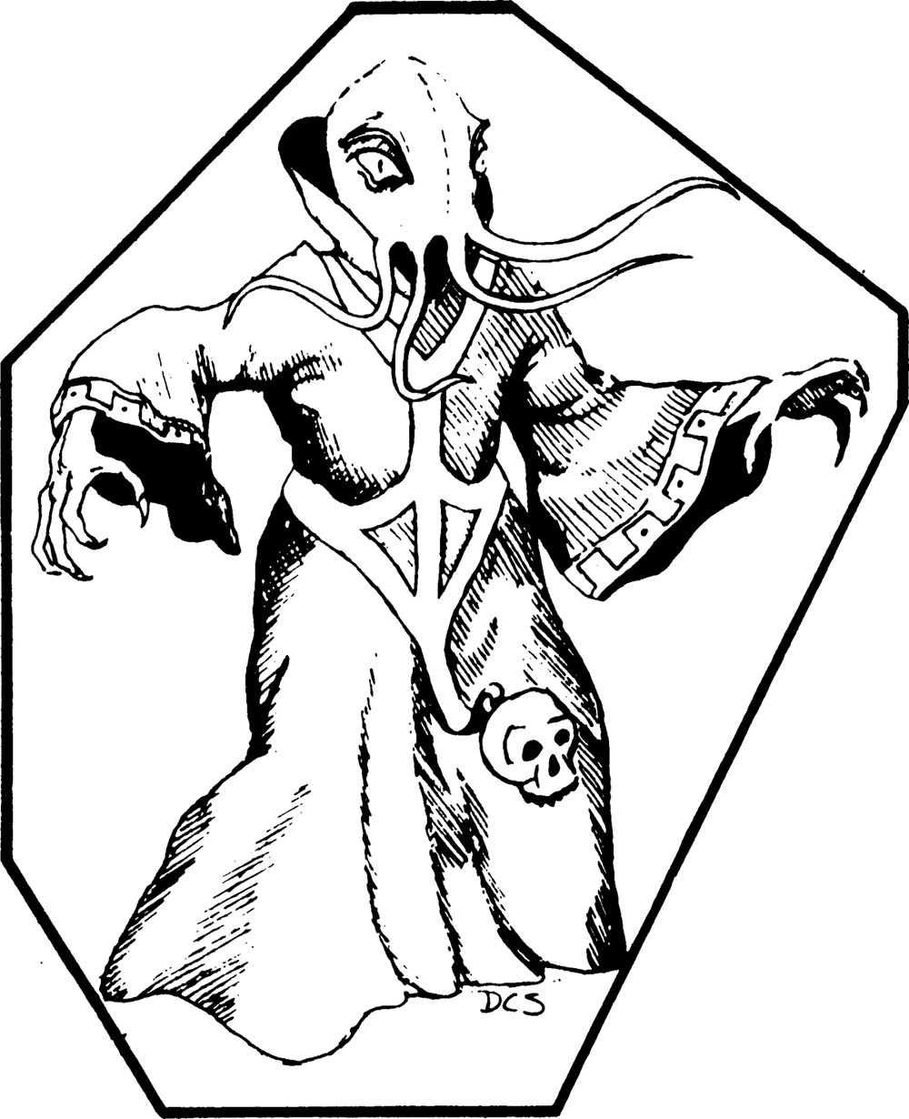
It took me a while to figure it out, but I think it’s the pupils that do it. The pupils swiftly transport us from “soulless psychic terror” to “Does that guy look a little bit like Zoidberg?”

5th Edition Orc

an orc from the fantasy role-playing game Dungeons & Dragons. The orc is portrayed as a muscular creature with greenish-grey skin and a grimacing facial expression, featuring small red eyes, a flat nose, and protruding lower tusks. It is clad in heavy, fur-lined armor with shoulder guards and bracers, and a brown tunic underneath. The orc's armor is functional rather than ornate, hinting at a utilitarian lifestyle. Its right hand is raised with fingers curled as if grasping an unseen object, and it wears a collection of bone and tooth necklaces, which may signify trophies or a form of rank. The background is a soft, undefined splash of color, giving the impression that the orc is standing in an open, possibly snowy space.

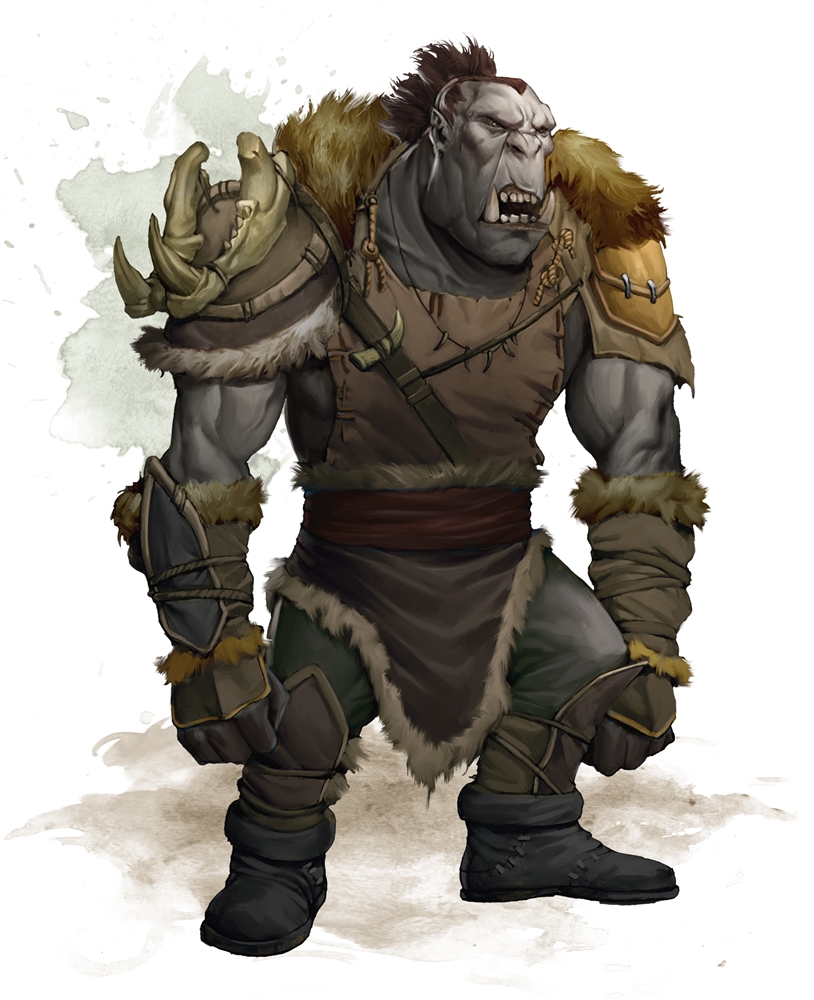
Between Warhammer 40k, Dungeons & Dragons and everything in between, we’ve really nailed down what an Orc (or Ork for 40kers) should look like and this is exactly it, a costume change could have this guy fighting Space Marines. For this reason, I’m not a huge fan of the 5e Orc art as I find it immersion breaking, I would have loved it if there was something that made it unique to D&D.
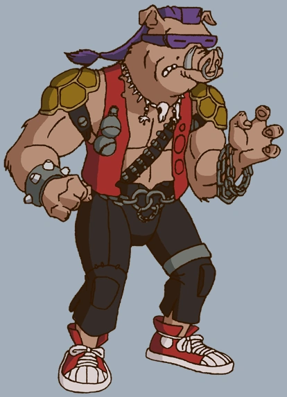
1st Edition Orc

A black and white line drawing of three orcs from the Dungeons & Dragons game, prepared for battle. The orcs are shown in profile, marching from right to left. Each orc is equipped with armor and round shields bearing a crescent moon emblem, and the lead orc carries a spear. Their armor is adorned with studs, and they wear helmets with horn-like decorations. The orcs' expressions are fierce, with snarling mouths and intense gazes. Their gear and marching pose convey a sense of unity and aggression. The image has a graphic quality typical of early role-playing game illustrations, emphasizing outlines and bold contrasts.

Okay, look, I understand the 1st edition Orc is essentially a man with a  pig’s head, I can see that, but I’m taking it. Bebop is far away in my conscious mind to cope with it, so I’m adopting these guys as my D&D Orc over the 5th edition, “Hey, is that the dude from Blood Bowl?”

5th Edition Owlbear

A creature with a unique blend of bear and owl features is shown in a stance that suggests readiness for action. It possesses a bear's hefty, powerful body, covered in thick, purple-tinged fur. The head is that of an owl, with a sharp beak and intense, forward-facing eyes, and the feathered tufts characteristic of an owl's ears rise prominently from the top of its head. Its forelimbs are muscular with large claws, poised as though it's about to pounce or defend itself. The expression on the creature's face is one of focused determination, and its overall posture conveys both strength and a primal nobility.

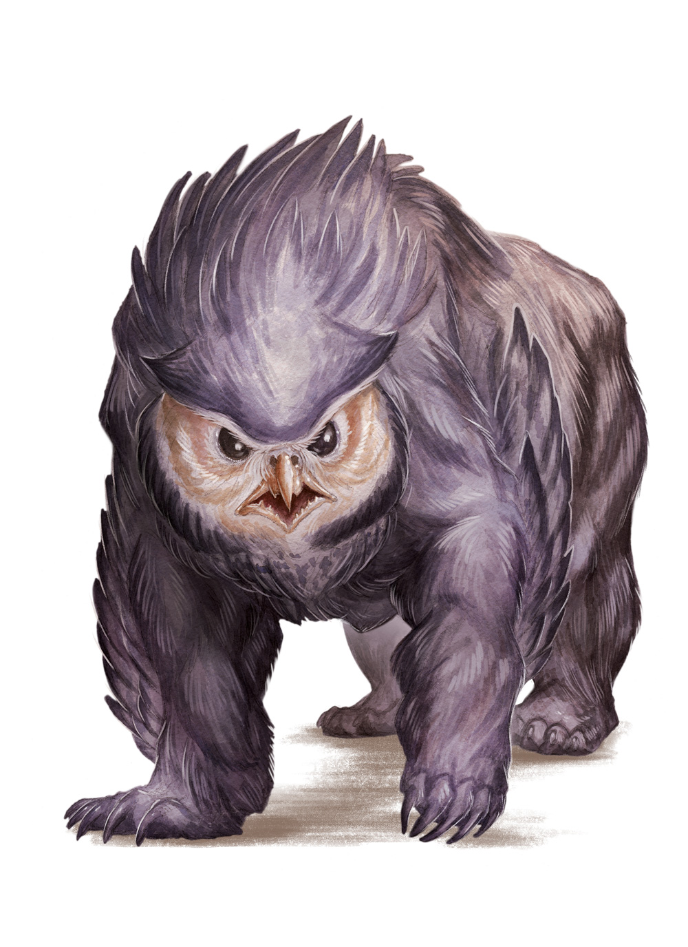
Apart from that D&D trailer, Baldur’s Gate 3 was the first time I did battle with an Owlbear. The 5th edition art is about 85% bear and 15% owl, which is the right way around. While I accept owls have sharp talons and those weird lopsided ears, bears are just outright terrifying, so bear + beak = bad times.

1st Edition Owlbear

A monochromatic ink drawing captures a fantastical creature known as an owlbear, standing upright. It features the body and claws of a bear, with the head of an owl, complete with a sharp beak and intense eyes. The creature's fur is rendered with heavy, textured strokes, emphasizing its wild and untamed nature. Its pose is animated, with its mouth open in a roar or screech, and its large claws held out in front, suggesting aggression or a defensive stance. The simple background of the image focuses all attention on the detailed depiction of this mythical beast.

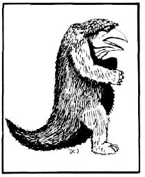
It looks like “bear with beak” was also in the notes for the 1st edition mockup of the Owlbear, look at the size of that pecker! I would say we’re about 15% owl in the 1st edition, but I couldn’t confidently say the other 85% is bear. To me, the 1st edition Owlbear looks like 15% owl, 25% armadillo, 25% capybara and maybe the remaining 35% of portlyness left over is bear. It’s like an owl-armadillo-bara that you’d be confident would do well in hibernation. I don’t understand why it has a massive tail, either.
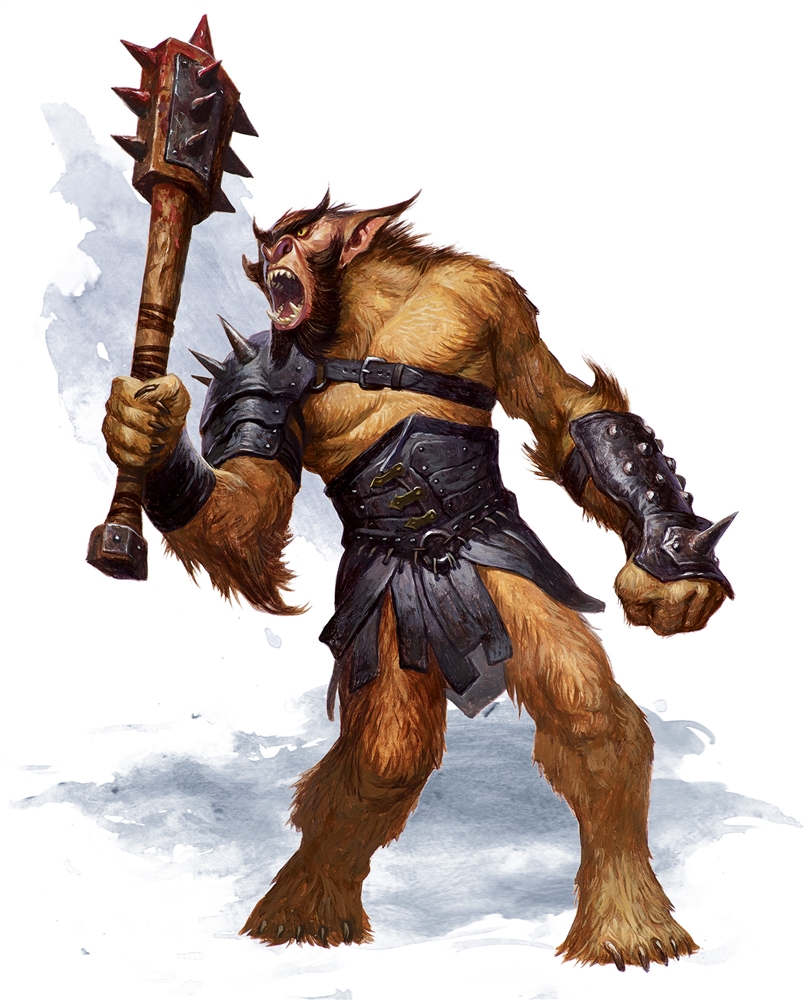
5th Edition Trolls

A towering troll looms forward, its skin a mottled green with darker green patches. The creature's lanky body is hunched, with one oversized hand reaching towards the ground, showcasing long, curved claws. Its other hand is raised slightly, echoing the pose of its counterpart. The troll's face is contorted into a malevolent grin, revealing pointed teeth, and its nose is flat and broad. Ragged, dark hair falls around its shoulders, and its eyes are narrowed and yellow, adding to its menacing expression. It wears a simple loin cloth secured by a rope belt. The background is minimal, with a faint wash of color, focusing attention on the troll's detailed musculature and textured skin.

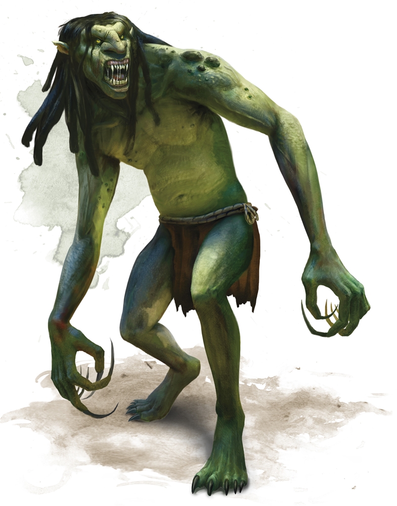
I hate Trolls. Not just the horrible internet kind, the D&D kind. Having to kill my first Troll during a campaign (being blissfully unaware of their… capabilities) was a harrowing experience. The 5th edition Troll art I think is great, they look fast, they look mean and it definitely gives you the impression that you’re going to pick up a nasty infection if you’re scratched. The artist did a great job with the “that thing wants to eat me” vibe.

1st Edition Trolls

Two gaunt figures, resembling emaciated trolls, are depicted in a stark black and white drawing. Their bodies are lean with visible ribs and sunken abdomens, showcasing a grotesque degree of thinness. Both creatures have long, thin arms and legs, with one troll standing upright and the other hunched over. The standing troll’s head is cocked to the side, its facial features twisted in an expression of hunger or aggression, while the hunched troll extends one claw-like hand forward. Each figure bears patchy textures that suggest a roughness or irregularity to their skin, typical of depictions of trolls in fantasy lore. The simplicity of the line work and the lack of background detail direct all focus to the stark physical characteristics of the creatures.

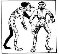
The 1st edition troll is the stuff of nightmares – just look at it. It must have been the inspiration for the chilling “walk past” scene in the movie Signs. The image is the kind of thing you’d expect to find scrawled in a journal from someone who went missing living on a remote farm one night. Maybe it’s because the lack of detail lets you fill in your own horrible details, but I think this is a D&D masterpiece.

5th Edition Umber Hulk

A hulking beast with a posture bent forward aggressively, this creature is an amalgamation of ape-like muscle and insectoid features. Its large, rounded body is a reddish-brown color, covered in bristly hair, and its arms are disproportionately long with vicious claws. A distinctive feature is its face, which instead of eyes, has a cluster of dark orbs, and a pair of large, curved mandibles framing a gaping maw. The creature's stance is primal and threatening, as if it's about to charge or has just spotted prey. The backdrop is minimal, with a wash of grey that serves to highlight the figure without providing a specific setting.

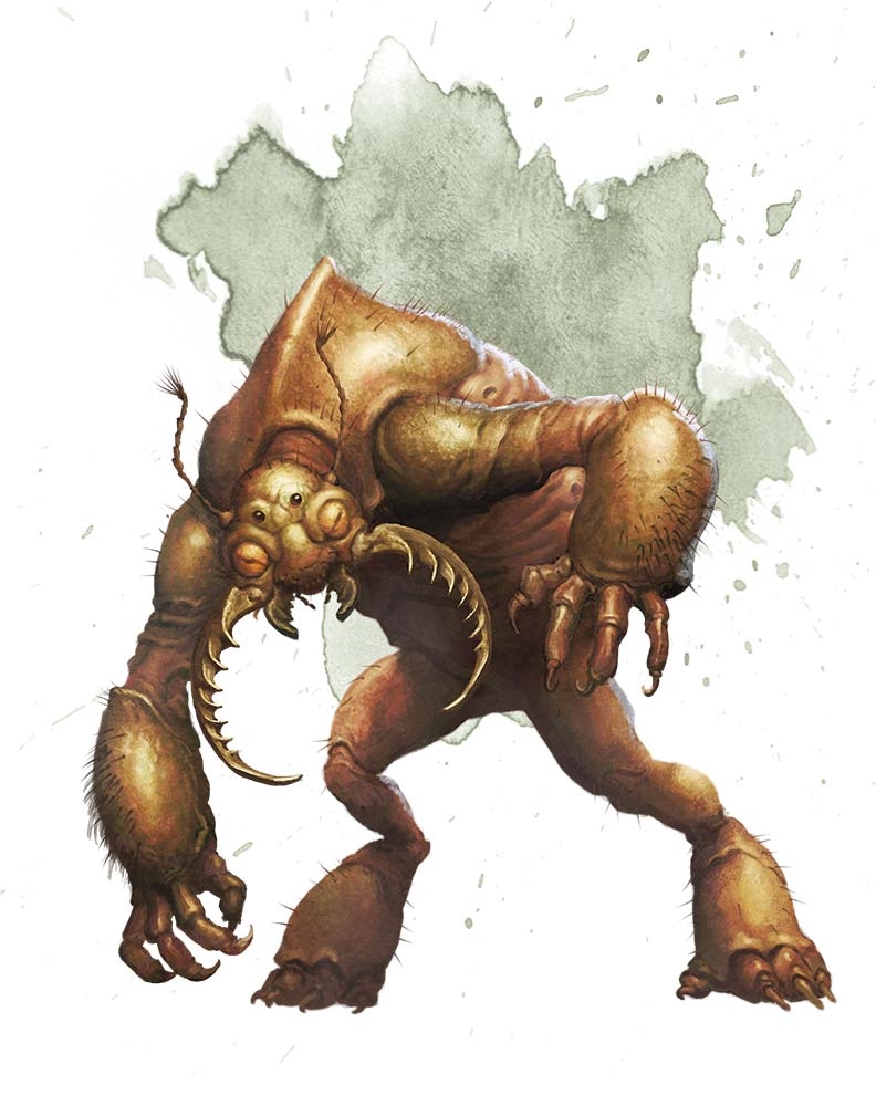
I remember clearly my first battle with Umber Hulks, 23 years ago in a rather tricky part of CRPG, Baldur’s Gate 2 and I think the 5e art is fantastic. The head is utterly grotesque, and armour plating really gets across what horrible chitinous shits these guys are.

1st Edition Umber Hulk

A black and white sketch shows a squat, monstrous figure reminiscent of a toad. It has thick, powerful limbs and large, clawed hands that convey a sense of strength. The creature's body appears sturdy, with a broad chest and a wide mouth filled with sharp teeth. Its round, bulging eyes sit atop its head, and it has a flat nose. The stance of the creature is one of readiness, as if it's crouching before leaping. The background is rough and sketchy, giving the impression of a cavern or rocky terrain, which frames the creature in a jagged, broken outline, possibly signifying its subterranean habitat.

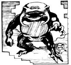
If there’s one thing that 5th edition professional art teaches you, it’s the importance of eyes in character design. You can see here in the original Umber Hulk, we can see that instead of the bulbous, horizontal splits of insectoid eyes that invoke a deep sense of unease, we have what appear to be panicked human eyes, comically close together and topped off with some worried eyebrows which look like they have been painted on the head… shell, I guess? The short, over-muscled limbs make the clawed “reach” toward the observer feel far less of a threat than a desperate grab to maintain balance after Uncle Umber Hulk helped himself to too much Christmas Sherry and now needs an emergency dash to the bathroom.

An artistic appreciation from where we came

While I’m certainly no artist myself, I can appreciate not how far the designs and art have come over the 37-year gap, but also how humourous much of this early art now seems in retrospect.

Maybe if you’re a DM and feel you want to change up a session and have a light-hearted tone, surprise your players and swap out some handouts for the “original” 1st edition art to see what reactions you get, when the terrifying beach-ball beholder is bouncing after them!

Was this article helpful?
YesNo
First introduced to D&D by the cRPG Baldur's Gate after borrowing it from a friend in 1998, Mark is currently experiencing repeated bouts of unconsciousness trying to take his melee Wizard through a 5e campaign.